Colors play a crucial role in design, influencing emotions, perceptions, and overall user experience. Understanding the differences between warm and cool colors and how to combine them effectively can elevate your designs and make them more impactful. This post will delve into the characteristics of warm and cool colors, their psychological effects, and provide practical tips for combining them in your projects.
Warm Colors: Characteristics and Psychological Effects
Warm colors include red, orange, yellow, and their various shades and tints. These colors are often associated with energy, warmth, and positivity. They can evoke feelings of excitement, passion, and comfort.
| Characteristics | Psychological Effects | |
|---|---|---|
| Red | Bold, vibrant, and attention-grabbing. | Red is often used to create a sense of urgency and can stimulate strong emotions. It is commonly used in marketing and branding to attract attention and convey energy. |
| Orange | Friendly, warm, and inviting. | Orange is a versatile color that can convey enthusiasm and creativity. It is often used to create a welcoming and inviting atmosphere. |
| Yellow | Bright, cheerful, and optimistic. | Yellow is associated with happiness and optimism. It can also enhance visibility and is often used to highlight important elements. |
Cool Colors: Characteristics and Psychological Effects
Cool colors include blue, green, purple, and their various shades and tints. These colors are often associated with calmness, tranquility, and professionalism. They can evoke feelings of relaxation, trust, and stability.
| Characteristics | Psychological Effects | |
|---|---|---|
| Blue | Calm, serene, and professional. | Blue is often used to create a sense of trust and reliability. It is commonly used in corporate and tech designs to convey professionalism and stability. |
| Green | Fresh, natural, and soothing. | Green is associated with nature and growth. It can create a sense of balance and harmony, making it ideal for health and wellness designs. |
| Purple | Luxurious, mysterious, and creative. | Purple is often used to convey luxury and creativity. It can also evoke a sense of mystery and intrigue, making it suitable for artistic and innovative designs. |
Combining Warm and Cool Colors
Combining warm and cool colors can create a dynamic and balanced design. Here are some practical methods for effectively blending these colors:
Practical Tips for Combining Warm and Cool Colors
Use a Dominant Color:
- Choose one color to dominate your design and use the other as an accent. For example, a blue-dominated design with red accents can create a professional yet energetic look.
Consider the Context:
- The context of your design will influence the color choices. For a health and wellness site, a green-dominated design with warm yellow accents can create a natural and inviting atmosphere.
Test with Real Users:
- Always test your color combinations with real users to ensure they are effective and appealing. User feedback can help you refine your design and make it more user-friendly.
Use Color Psychology:
- Understand the psychological effects of colors and use them to your advantage. For example, blue can create a sense of trust, while red can create a sense of urgency.
Balance Warm and Cool:
- Ensure that your design has a balance of warm and cool colors. Too much of one can make the design feel unbalanced or overwhelming. Use a color wheel to help you find the right balance.
Combining Warm and Cool Colors in a Real Project
Let’s look at a case study to see how combining warm and cool colors can enhance a real design project.
Project: Redesigning a Travel Agency Website
Objective: To create a visually appealing and user-friendly website that encourages users to book travel packages.
Color Scheme:
- Dominant Color: Blue (to convey trust and reliability)
- Accent Colors: Orange and Yellow (to create a sense of excitement and warmth)
Process:
- Research: Used Awwwards and SiteInspire to gather ideas for travel agency websites. Noted the use of blue for trust and orange/yellow for excitement.
- Sketching: Created initial sketches using a blue-dominated color scheme with orange and yellow accents.
- Prototyping: Developed a prototype and tested it with real users to ensure the color combinations were effective and appealing.
- Refinement: Adjusted the color balance based on user feedback to create a more harmonious and engaging design.
- Final Design: Combined blue, orange, and yellow to create a travel agency website that is both professional and exciting, encouraging users to explore and book travel packages.
Conclusion
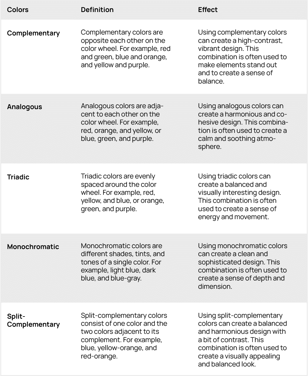
Understanding the differences between warm and cool colors and how to combine them effectively can significantly enhance your design projects. Warm colors are energetic and attention-grabbing, while cool colors are calming and professional. By using complementary, analogous, triadic, monochromatic, and split-complementary color schemes, you can create dynamic and balanced designs. Always consider the context and test your color combinations with real users to ensure they are effective and appealing. Whether you are designing a travel agency website, a corporate site, or a personal portfolio, the right color combinations can make a world of difference.
Frequently Asked Questions (FAQ)
What are warm colors, and what emotions do they evoke?
Warm colors include red, orange, and yellow. They evoke emotions of energy, warmth, and positivity. Warm colors can create a sense of urgency, excitement, and comfort.
What are cool colors, and what emotions do they evoke?
Cool colors include blue, green, and purple. They evoke emotions of calmness, tranquility, and professionalism. Cool colors can create a sense of trust, relaxation, and stability.
How can I use complementary colors in my design?
Complementary colors are opposite each other on the color wheel, such as red and green, blue and orange, and yellow and purple. Using complementary colors can create a high-contrast, vibrant design. Choose one color as the dominant and the other as an accent to make elements stand out and create balance.
What is the best way to balance warm and cool colors in a design?
To balance warm and cool colors, use a color wheel to find the right combination. Choose one color to dominate and use the other as an accent. Consider the context of your design and the emotions you want to evoke. Test your color combinations with real users to ensure they are effective and appealing.
Can I use a monochromatic color scheme with both warm and cool colors?
Yes, you can use a monochromatic color scheme with both warm and cool colors. A monochromatic scheme involves different shades, tints, and tones of a single color. For example, you can use a range of blue shades with a few warm yellow accents to create a sophisticated and balanced design.